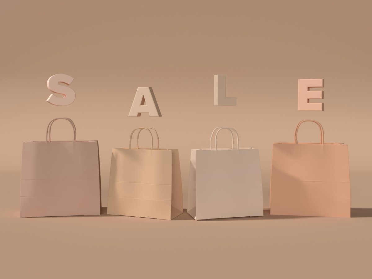
 This image is used solely for illustrative purposes. We do not intend to offend or conflict with any societal, cultural, religious, or political values. Image Source: Unsplash+
Layout Design Tips: “Actions speak louder than words” is justifiable here if we replace the word Actions with Pictures. An e-commerce store looks great when there are sparkling images that communicate with the people visiting the site, isn’t it? Also, a beautifully designed page attracts more viewers and turns them into regular customers. How?
Of course, a nice layout wins the interest of the viewers over a badly designed page that is unsuccessful in narrating a story. With the use of appealing images, you can show people what you are and what your worth is. Perhaps, it will be easy for them to decide whether or not you are a reputed brand in the market.
Now suppose, you have a nice homepage that you have promoted on the social network, and people land there via that link. They will see an attractive page with all the things they want to see there. Your promotion is successful! But what if they navigate to the product page and it is not as visually good as the homepage? Will you lose this visitor? Definitely not! Here you should think of designing all the pages with an equal appeal which results in more sales.
Earn more customers following these page Layout Design Tips:
Keep the Balance [ Layout Design Tips ]
Balance is essential to design an impressive page layout that satisfies the customer visiting the site. Create a layout that doesn’t overwhelm or underwhelm the people on your site who want to make a purchase. If the design is nice and balanced with some white spaces on the pages, the viewers will emphasize more on the areas you want them to. Be balanced with the images, text, and other elements on the site to keep the viewers content.
Put the Perfect Sized Images
Images play a major role in capturing the minds of the viewers as I said in the opening line. Exceptionally designed images are perceived better by the people and also the bigger images attract them first. Avoid adding smaller images as they can push the viewers away!
Professionalism reflects in the bigger images as you can convey nice messages through such imagery. Also, the hierarchical layout of the pages keeps the viewers hooked owing to the ease and simplicity it offers. In the bigger images, you can add the best-selling products or hot deals to grab the attention of the viewers which will, in turn, add to more sales.
Goodbye to Distractive Items
No matter, adding too much promotional stuff on the site seems good to many e-commerce store owners. But in my view, this is not a wise idea to show people what they don’t want to see. Like if the customer walks off to the checkout page, he just wants to pay and order the product. In that instance, if you will keep on showing them unrelated things like subscribing to the newsletter or following the social media pages, they might get sidetracked.
What’s more important is to increase sales by offering an easy checkout over the distractive process instead. To avoid such situations, don’t use unrelated elements on the website.
Keep in mind that every single page is designed to serve its own purpose, so don’t go out of the way, or else you will be waiting to make the sales forever. Good luck!
#Layout Design Tips

![Graduation Party Ideas [ Make Dream Celebration ]](https://www.cutoutimage.com/wp-content/uploads/2023/07/Geaduation-Party-Ideas-1.jpg)

