Disclaimer: This blog is for general informational and inspirational purposes only, based on publicly available information and personal insights. Images—whether of models, screenshots, or products—are for illustrative purposes only and do not depict actual subjects, scenarios, or views described. We do not intend to offend or conflict with any societal, cultural, religious, or political values.
Ensure you are addicted to creating a masterpiece in Photoshop but editing clichés not only hampers your artistic skills but also give a bad effect on the viewers. You will not realize when by overusing the features you have doomed an image. You can still expect room for flaws once in a blue moon but when these bugs start occurring on regular basis, it will highly affect the design. These are the 5 clichés that I am stating here and also the ways to turn them around to create a magnum opus. Here are 5 photography clichés you need to avoid:
#1: Square Format:
Defining the trends in Photoshop and considering the latest images that are coming upfront, you can see square format quite fondly available. The composition of an image has to be so done that the format only takes the look of the image to an extreme level. It’s high time to give up old-school techniques and embrace the new formats. Square is the vogue of today and the images are mostly delivered in panoramic view. While composing an image, this measure has to be kept in mind to avoid clichés.
#2: Frames and Borders:
Who thinks that frames and borders make an image look enhanced and more appealing to the eyes? Well, if you are a skilled designer with an amazing choice of using props, you will never use a frame or a border. These look dreadfully awful and you can say, talk of the past time. There are some images where you can still survive the site of frames, but images that are used these days are at a decent distance from these historical features.
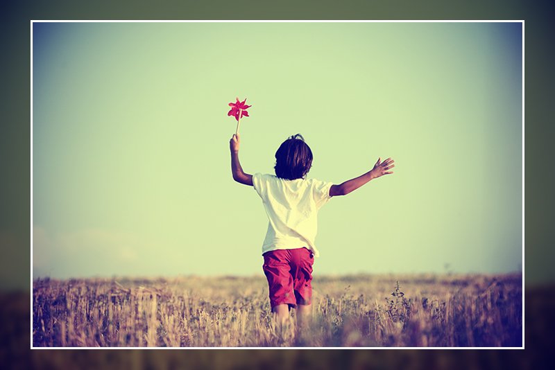 This image is used solely for illustrative purposes. We do not intend to offend or conflict with any societal, cultural, religious, or political values. Image Source: Shutterstock
#3: Disproportionate Retouching:
Design scenario says that many designers are prone to giving exclusive looks to the image and in intent to do so, they usually end up doing disproportionate retouching. Little usage of retouching features in image editing software is obvious and necessary but overdoing stuff will always ruin the picture. Overdoing is insolent and the biggest cliché in the history of image editing.
 This image is used solely for illustrative purposes. We do not intend to offend or conflict with any societal, cultural, religious, or political values. Image Source: Shutterstock
#4: Imitate and Unwanted Lens Flicker:
In some images, the imitation of lens flare looks amazingly gorgeous. It gives the image a more professional and realistic look. But something to wonder is is every image ready for the flicker? Designers need to understand that every image is not the same. You might create the effect but it can strangle the demeanor of the image instantly. Defining the requirement of an image teaches you the art of the usage of features. That is why you have to be extra alert by using these add-ons.
#5: High Dynamic Range Techniques:
Natural HDR is quite essential for the image. It adds a factor of realism to the image by creating shadows and highlighting the focus points. At the same time, this feature must be used very cautiously. You must not slop the feature on an image where it is not required. It can produce amazing results, only if you know how to take the best benefit from it.


![Graduation Party Ideas [ Make Dream Celebration ]](https://www.cutoutimage.com/wp-content/uploads/2023/07/Geaduation-Party-Ideas-1.jpg)